Introduction to Causal Inference
Causal Inference and Digital Causality Lab
University of Hamburg
Welcome to Causal Inference and Digital Causality Lab!
Welcome!
About the lecture
- Lecture (3 SWS, Prof. Dr. Martin Spindler)
- Introduction to methods and theoretical concepts
- How can we assess causal relationships based on data?
- Synchronous virtual meetings zoom
- Wednesday, 8.30 am to 11.00 am
- Questions to oliver.schacht@uni-hamburg.de
Welcome!
About the lecture
- How to make the most out of the lecture
- Carefully attend the lecture
- Read the corresponding book chapters
- Go through the examples
- Try out things on your own and practice (in the DCL)
Welcome!
About the Digital Causality Lab
- Digital Causality Lab (1 SWS, Oliver Schacht)
- New - replaces the former tutorial
- Focus on practice, implementation and tools
- Data Literacy skills
- Independent learning and collaboration
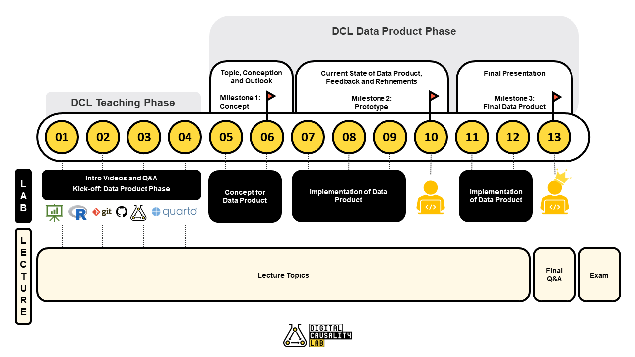
- Teaching Phase and Data Product Phase
- Wednesday, 2 pm and 3 pm, WiWi 2079
- Questions to oliver.schacht@uni-hamburg.de

Welcome!
1. Teaching Phase
Notebooks available from the DCL website
Introductory videos on Lecture2Go (link available in STiNE)
Q & A in in-person meetings with Oliver

Welcome!
1. Teaching Phase
Topics and Tools
- Recap: Statistics
- Introduction to R
- Introduction to GitHub and Git
- R for Causal Inference
- Data Products with Quarto

Welcome!
2. Data Product Phase
- Independent development of a data product on causality
- Solve case study in a group of students
- Choose a topic that you find interesting!
- Creative solution: It’s all up to you, from the concept to the implementation
- Three milestones (concept, midterm, final)
- From week 3/4 on

Welcome!
2. Data Product Phase
- Case Study Topics
- Illustration of causal phenomena
- Graphical approaches
- Real-data examples
- Illustration of estimation approaches
- Causal estimation in practice
- List of potential topics for case studies available here

Welcome!
About the DCL
- How to make the most out of the DCL
- Prepare the first lab sessions: Videos and notebooks
- Be there and participate actively
- Ask questions
- Collaborate with your colleagues and help others
- Be creative

Always keep your head up: Don’t get frutstrated too easily
Outlook
Plan for the course
Organizational Matters
Organizational Matters
Course intended for bachelor students (4th or 6th semester)
Course website:
- Digital Causality Lab: https://digitalcausalitylab.github.io/
- Lecture slides and announcements on STiNE
- Notebooks and additional materials available at DCL website
- Gallery of previous case studies available here
Organizatioal Matters
Examination
- Oral exam, July 12, 2023 & September 29, 2023
- 15 minutes
- Two parts:
- Short presentation
- Questions
- More information will be provided soon
Digital Causality Lab
Bonus of 0.3 points possible
Collaborative data product development
Final presentation at the end of the semester
Bonus criteria
- Collaboration in team with up to 3 students
- Pass 3 milestones (conception, midterm, final)
Scope of the Course
Scope of the Course
- The course covers the basics of causal inference
- key concepts of causal inference:
- counterfactuals,
- causal effects,
- graphical models
- statistical methods for causality:
- randomized experiments,
- observational studies,
- identification of causal effects,
- estimation
- key concepts of causal inference:
Scope of the Course
- You will acquire some skills that you will find helpful in your studies and later in your job/research, e.g.,
- how to formalize general intuition in a tractable way
- how to derive hypotheses that can be tested with data
- problem-oriented and self-organized learning (and teaching)
- ability to distinguish association from causation - very important for your whole life! :)
Scope of the Course
- In the DCL, we will learn important data literacy skills, in terms of
- tools for data analysis (programming in R)
- organization and collaboration (version control with Git)
- development of a data product
Scope of the Course
- The course is a good complement to our seminar on causal inference.
- Bachelor thesis is possible, for example
- based on your seminar thesis
- based on the DCL data product
Introduction to Causal Inference
Motivating Examples
Correlation vs. causation
We must learn to analyze data and assess causal claims — a skill that is increasingly important for business and government leaders.
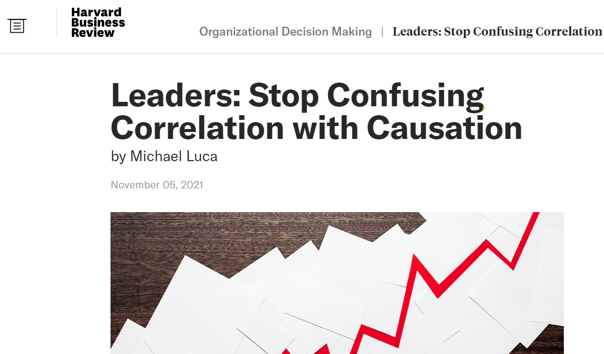
Source: https://hbr.org/2021/11/leaders-stop-confusing-correlation-with-causation
Motivating Examples
Simpson’s paradox
Example 1.2.1
We record the recovery rates of 700 patients who were given access to the drug. A total of 350 patients chose to take the drug and 350 patients did not. The results of the study are shown in Table 1.1.
| Drug | No drug | |
|---|---|---|
| Men | 81 out of 87 recovered (93%) | 234 out of 270 recovered (87%) |
| Women | 192 out of 263 recovered (73%) | 55 out of 80 recovered (69%) |
| Combined data | 273 out of 350 recovered (78%) | 289 out of 350 recovered (83%) |
Source: Glymour, Pearl, and Jewell (2016)
Motivating Examples
Simpson’s paradox: does more exercise lead to higher cholesterol?
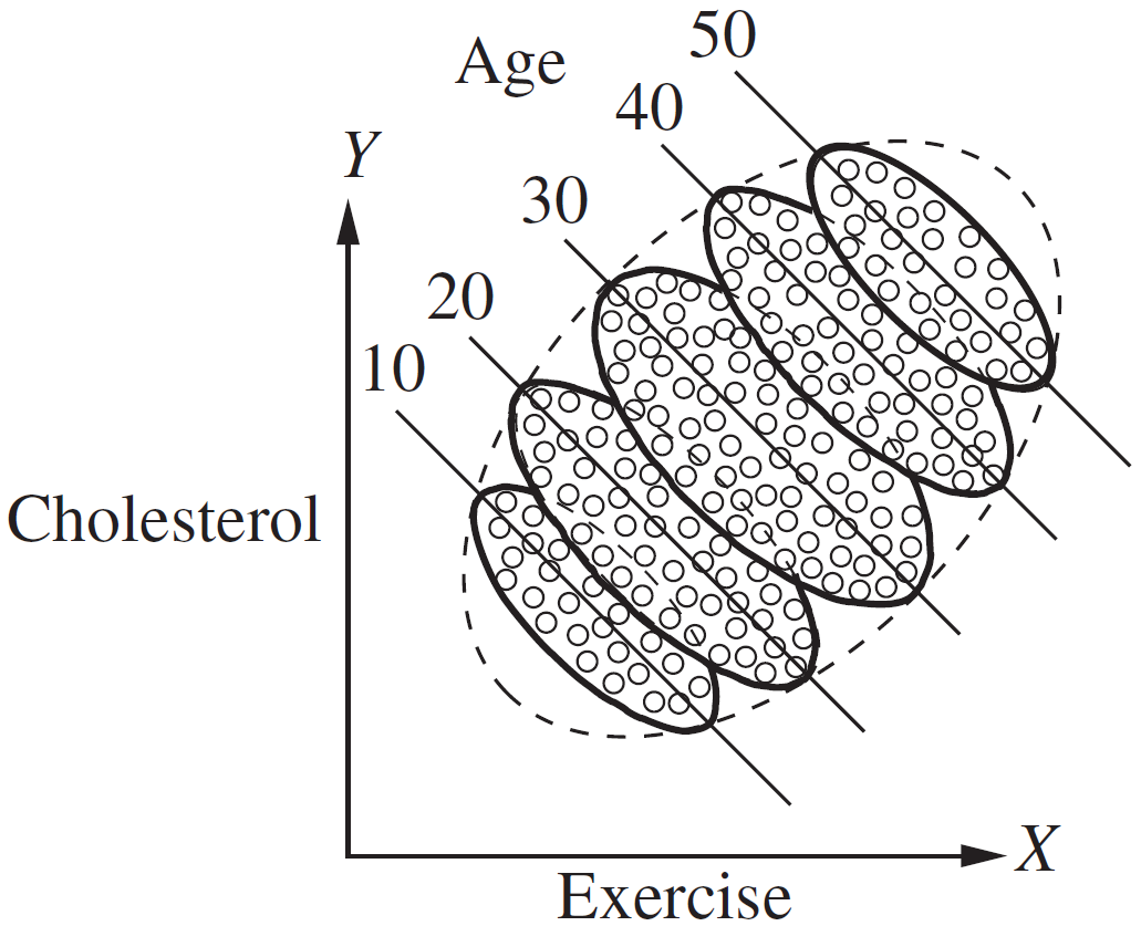
Figure 1.1 Results of the exercise–cholesterol study, segregated by age
Source: Glymour, Pearl, and Jewell (2016)
Motivating Examples
Simpson’s paradox: does more exercise lead to higher cholesterol?
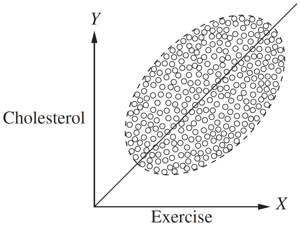
Figure 1.2 Results of the exercise–cholesterol study, unsegregated. The data points are identical to those of Figure 1.1, except the boundaries between the various age groups are not shown
Source: Glymour, Pearl, and Jewell (2016)
Motivating Examples
Simpson’s paradox: does more exercise lead to higher cholesterol?
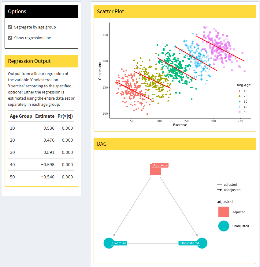
App: https://simpsons-paradox.herokuapp.com/
Source: Glymour, Pearl, and Jewell (2016)
Motivating Examples
Do hospitals make people sicker?
2.1 The Selection Problem Specifically, it includes a question “During the past 12 months, was the respondent a patient in a hospital overnight?” which we can use to identify recent hospital visitors. The NHIS also asks “Would you say your health in general is excellent, very good, good, fair, poor?” The following table displays the mean health status (assigning a 1 to excellent health and a 5 to poor health) among those who have been hospitalized and those who have not (tabulated from the 2005 NHIS):
Source: Angrist and Pischke (2009)
Motivating Examples
Do hospitals make people sicker?
| Group | Sample Size | Mean health status | Std. Error |
|---|---|---|---|
| Hospital | 7774 | 2.79 | 0.014 |
| No Hospital | 90049 | 2.07 | 0.003 |
The difference in the means is 0.71, a large and highly significant contrast in favor of the non-hospitalized, with a \(t\)-statistic of 58.9.
Source: Angrist and Pischke (2009)
Motivating Examples
Estimation of price elasticities
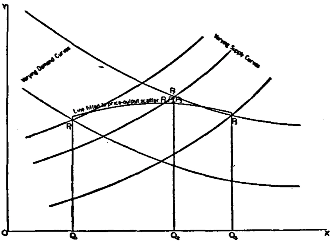
Figure 1.2: Wright’s graphical demonstration of the identification problem. Figure from Wright et al. (1928).
Motivating Examples
Estimation of price elasticities
The price elasticity of demand is the solution to the following equation: \[\epsilon = \frac{\partial \log Q}{\partial \log P}\]
One possible example of an econometric model would be a linear demand function: \[\log Q_d = \alpha+\delta \log P+\gamma X + u\] where \(\alpha\) is the intercept, \(\delta\) is the elasticity of demand, \(X\) is a matrix of factors that determine demand like the prices of other goods or income, \(\gamma\) is the coefficient on the relationship between \(X\) and \(Q_d\), and \(u\) is the error term.
Source: Cunningham (2021), https://mixtape.scunning.com/01-introduction#example-identifying-price-elasticity-of-demand
Motivating Examples
Labor market example
- What is the causal effect of a training on employees’ wages?

Figure 2.1.1: The causal effect of the treatment on the outcome
Source: Huber (2023), Chapter 2.1
Motivating Examples
Chocolate consumption and nobel prizes
Messerli (2012) reports that there is a significant correlation between a country’s chocolate consumption (per capita) and the number of Nobel prizes awarded to its citizens (also per capita), see Figure 1.1.
Motivating Examples
Chocolate consumption and nobel prizes
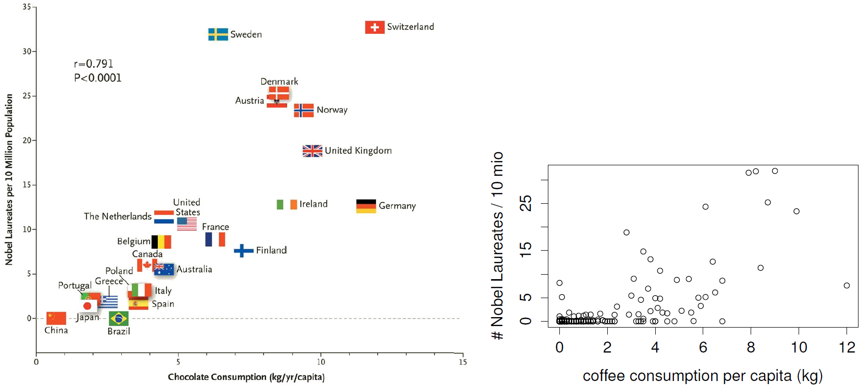
Figure 1.1: The left figure is slightly modified from Messerli (2012), it shows a significant correlation between a country’s consumption of chocolate and the number of Nobel prizes (averaged per person). The right figure shows a similar result for coffee consumption; the data are based on Wikipedia (2013b,a).
Source: Peters (2015)
Motivating Examples
Chocolate consumption and nobel prizes
These correlations are properties of some observational distribution \(\mathbb{P}^{X}\). We must be careful with drawing conclusions like “Eating chocolate produces Nobel prize.” or “Geniuses are more likely to eat lots of chocolate”, see Figure 1.2 because these statements are “causal”.
Motivating Examples
Chocolate consumption and nobel prizes
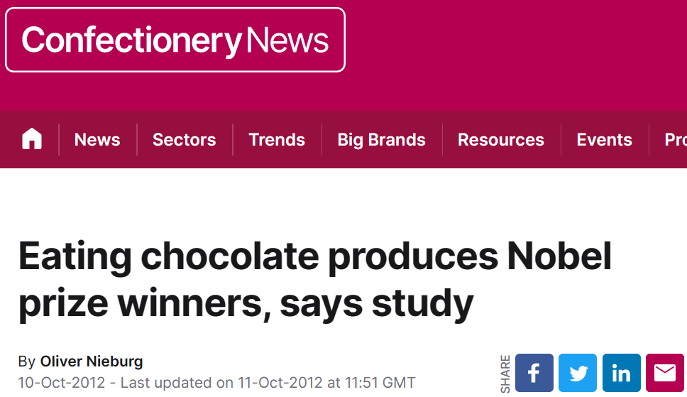
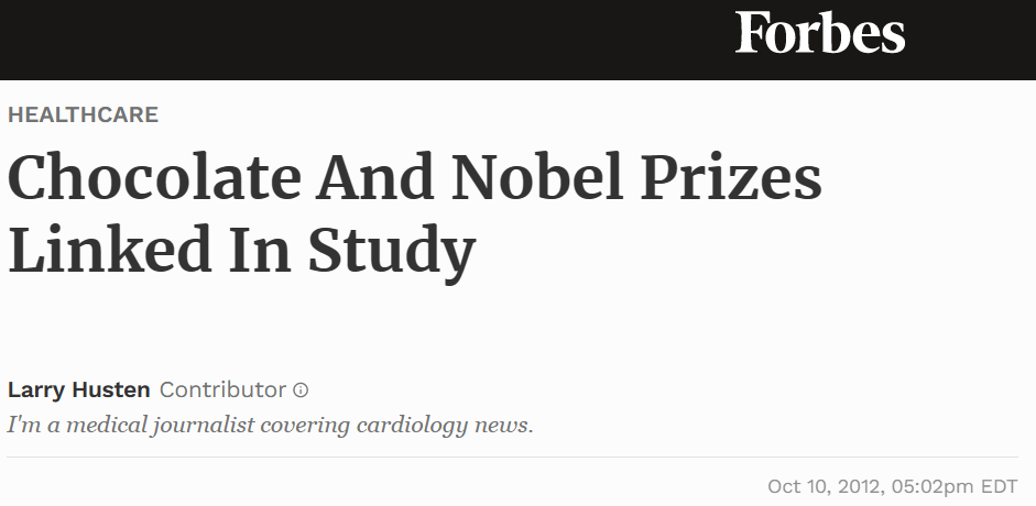
Figure 1.2: Two online articles (downloaded from confectionarynews.com and forbes.com on Jan 29th 2013) drawing causal conclusions from the observed correlation between chocolate consumption and Nobel prizes, see Figure 1.1.
Source: Peters (2015)
Outlook
Outlook
About this course
Introduction to methods and theoretical concepts
How can we assess causal relationships based on data?
Learn the language and tools of causal analysis
- Language: Formalize intuition for analysis of causal relationships
- Tools: Estimation approaches and software for empirical analysis
Introduction to Causality
Introduction to Causality
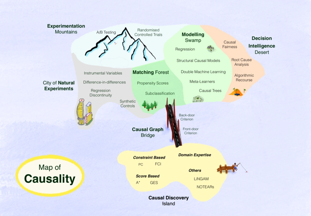
Map of causality
Source: “Map of Causality.” (2023)
Introduction to Causality
Causation vs. Non-Causation
Overarching goal: Does a treatment or intervention, \(D\), have a causal effect on an outcome variable of interest, \(Y\)?
Key question: What would happen in the absence of the treatment?
- \(\Rightarrow\) Potential outcome
Fundamental problem of causal inference: We can never observe the world with and without a particular intervention
- Under certain assumptions, one of the individual’s potential outcomes is realized and one remains counterfactual
- \(\Rightarrow\) We can never estimate indivudal causal effects, in general
Introduction to Causality
Randomized control trials (RCT)
RCTs are often considered as the gold standard of causal inference
In RCTs, the treatment can be assigned randomly to individuals
- Treatment group: Receives the treatment (\(D=1\))
- Control group: Does not receive the treatment or receives a placebo (\(D=0\))
Under certain assumptions, random assignment allows to estimate the average causal effect as the difference of the mean outcome of the treatment and control group
Introduction to Causality
Observational studies
Optimization Makes Everything Endogenous
In observational studies, individuals self-select into the treatment, i.e., they choose the treatment status that gives them the best potential outcome
Introduction to Causality
Observational studies
Hence, a simple comparison of treatment vs. control group does not generally reveal the causal effect
The resulting bias is also called confounding bias, omitted variable bias or treatment selection bias (Huber 2023)
Solutions:
- Explicitly address selection, e.g., by matching comparable individuals in treatment and control group
- Use quasi-experimental methods, e.g., treatment eligibility vs. treatment value
Introduction to Causality
Directed acyclic graphs (DAGs)
Graphical methods to illustrate causal relationships
Graphs allow to make statements on statistical relationship of variables, e.g. stochastic independence
Two example DAGs
- RCT with \(D\rightarrow Y\) (see Huber (2023), Figure 2.1.1)

Figure 2.1.1: The causal effect of the treatment on the outcome
Introduction to Causality
Directed acyclic graphs (DAGs)
- Observational Study / Confounding: \(D \rightarrow Y\), \(D \leftarrow U \rightarrow Y\) (see Huber (2023), Figure 2.2.2)
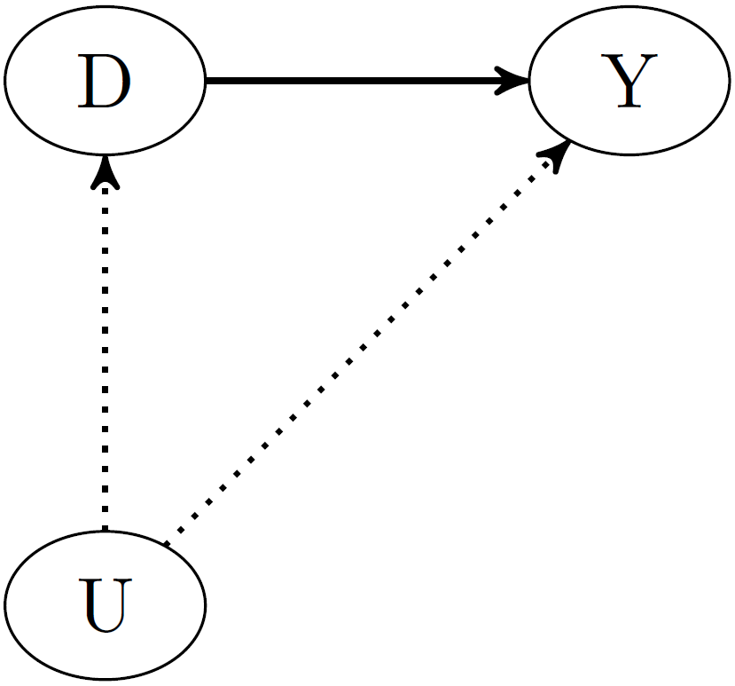
Figure 2.2.2: Treatment selection bias
Outlook
Key methods for causal analysis
- Theoretical foundations:
- Potential outcomes
- Assumptions
- Randomized experiments
- Observational studies
- Directed acyclic graphs
- Toolbox: Estimation approaches
Literature
In this course, we will use the books
- Causal Analysis by Martin Huber (Huber 2023)
- Causal Inference: The Mixtape by Scott Cunningham (Cunningham 2021)
- The Effect by Nick Huntington-Klein (Huntington-Klein 2021)
- Causal Inference: A Primer by Judea Pearl et al. (Glymour, Pearl, and Jewell 2016)
- What if by Miguel Hernán and James Robins (Hernán and Robins 2010)
References
References
Causal Inference & DCL